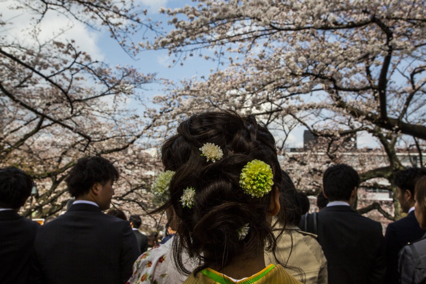
You have the right words to describe your favourite place but the photos don't do it any justice. How do you take photos that capture the imagination and entice others to a certain place? In this easy-to-follow Japan Travel three-part photography guide, I will take you through some basics that might help you bring out the best in your photographs with some of my own.
Overview
First off, this isn't a DSLR-only guide — there will be no in-depth explanations of ISO, aperture, or shutter speed. This general guide is meant to help those using their phone cameras as well so there is no handicap here, and all technical terms will be explained without jargon.
In this article, we will go through how to frame a picture. One of the most important aspects of photography, framing helps to draw your attention to certain areas of the photo. You might have seen photos that are filled with people and other distractions and you don't know where to look; this is where framing comes in.
Typically, there are four basic kinds of framing that photographers use: Rule of Thirds, Phi Grid, Leading Lines, and Golden Ratio.
Rule of Thirds
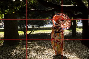
For anyone who have dipped their feet in photography, you would have heard of the Rule of Thirds at least once. This framing method describes a photo that has bee divided into nine equal sections, or into thirds. Naturally, the viewer's eyes will be drawn to the four intersection points — that's where you want to place your subject.
In the example below, the lady is along the right vertical line and off-centre, with her umbrella placed on the top right intersection because that's what I want you to notice. Simply put, if you spot something you want the viewers to see in a photo, imagine the grid when taking the shot and click away. Of course, the same concept applies to the intersections on left too.

Phi Grid
The Phi Grid is the Rule of Thirds' lesser known cousin. Not many casual photographers, including myself, use it often as compared to the Rule of Thirds but the Phi Grid can be essential in enhancing a landscape more than the former.
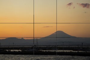
Similar to the Rule of Thirds, the photo is divided up in the Phi Grid, but not into equal portions. Instantly, you can see that the horizontal lines are closer to each other than those in the Rule of Thirds.
This framing method works when you want to align the horizon with either horizontal line, or if the contents around the four corners are heavier. There is no hard rule on the intersections but a subject may be positioned there similar to the Rule of Thirds.

Leading Lines
Another quick way to draw attention to something in your photo is to use leading lines. It's basically what it's named — using lines to lead the viewer towards a point of interest in the photo. In the example below, the road brings your eyes through the cherry blossom trees lining the sides.
A great way to advance this technique is to use curved lines instead of straight ones all the time. For example, you may want to lead your viewers to a person standing at the end of a bend.

Golden Ratio
The most difficult frame to pull off, and requires much practice, the Golden Ratio is based off the Fibonacci sequence, a set of numbers found by adding up the two previous numbers: 0, 1, 1, 2, 3, 5, 8, 13, 32, 34 and so on. While you don't need to do any math for this, what you need to visualise is the spiral that will eventually draw your viewers' eyes to the "sweet spot", the smallest point in the spiral.
In the photo below, the spiral leads your eyes towards the man, who is minuscule and in the smallest point (enlarge the photo to see the full spiral). This framing works especially well in portraits, where the "sweet spot" would usually be the eyes of the subject.

Conclusion
Framing your photo is important as you need to decide what's special about it. If you include too many things, the photo just looks messy and the viewer won't be able to decide what he should be looking at. Tell your viewer what to focus on by getting the framing right.
The Japan Travel community has many amazing photographers contributing their work and here are two examples of good framing to refer to:
1. https://en.japantravel.com/kochi/pirate-ship-of-tosa/17642
2. https://en.japantravel.com/tokyo/sensoji-temple-overview/3701
Head to our next photography guide here.


